




Photo test page
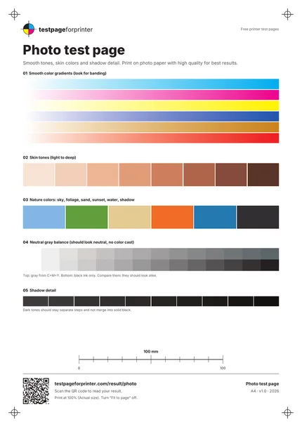
A photo test page for printer use that checks gradients, skin tones, nature colors, gray balance and shadow detail with patches, not a photograph.
What each part checks
One sheet. Six useful checks.
Six smooth gradients
Cyan, magenta, yellow, a blue, a warm tone and a red, each fading from white. Visible bands are the thing to look for.
Eight skin tones
Patches from light to deep. They should look natural, without a pink, green or gray cast.
Six nature colors
Sky, foliage, sand, sunset, water and shadow. These are familiar colors that reveal tone and saturation shifts.
Gray balance
A gray made from cyan, magenta and yellow above a gray made from black ink only. They should look alike.
Shadow detail steps
Ten dark steps in a row. They should stay distinct and not merge into one block of black.
Footer
A QR code to read your result, the short URL, a reminder to print at 100%, and paper size and version.
How to read your print
- Smooth gradients.
- Gradients should fade evenly. Visible stripes or steps are banding.
- Natural skin tones.
- No patch should look orange, gray or pink compared with its neighbors.
- Matching grays.
- If the two gray rows differ clearly in hue, one of your inks is out of balance, or the printer is mixing gray differently.
- Separate shadows.
- You should be able to tell the dark steps apart. If they merge, shadow detail is being lost.
Print settings that matter
- Print at actual size (100%)Choose Actual size or 100% and turn off Fit to page. Menu names vary by program.
- Match the paper type to the paperIf you load photo paper, choose the matching paper type in the print settings. A mismatch is a common cause of color shifts and smearing.
- Choose High or Photo qualityUse High or Photo quality for this sheet, and let the printer manage color, if offered. Names vary by program and printer.
Related sheets


What this photo test page is
This is a photo test page for printer checks, and it is honest about what it is: it does not contain a photograph. It uses color patches and smooth gradients that stress the same things photos stress: skin tones, skies and foliage, neutral grays and dark shadows. That makes defects easier to see than they would be in a busy picture. It is not a calibration tool. It will not tell you your printer is color accurate, and it cannot replace a profile or a hardware calibrator.
When to use it
Use it as a photo printer test before you spend photo paper on a large print, when photos look too warm, too green or too dark, when you try a new paper, or when you compare two quality settings. It is a quick way to see whether a problem is the printer or the photo itself.
How to print it
- Pick the Letter or A4 PDF that matches your paper. See A4 vs Letter.
- Open the PDF and choose Actual size or 100%.
- If you use photo paper, select the matching paper type, then print at High quality.
- Let the print dry for a few minutes, then look at it in daylight or neutral light.
Where those settings live depends on your system. See the Windows and Mac guides.
What good looks like
Gradients fade smoothly with no visible bands. Skin tones look natural from light to deep. The sky, foliage and water patches look plausible. The two gray rows look alike. Dark steps stay separate. Remember that color on paper never matches a screen exactly. See CMYK vs RGB for the reason.
What bad looks like
Stripes across a gradient are banding. A tint over the whole page, or grays that lean pink or green, are covered under wrong colors. A pale or absent patch is missing color. If dark steps merge into solid black, try a higher quality setting and the correct paper type before changing anything else.
Because this sheet is made of patches, you can also use it to compare two papers or two quality settings. Print once for each, label the backs, and put them side by side in the same light. Look at the gradients first, since banding is the easiest difference to see.
What to do next
Scan the QR code or open Read your result to match your print to a likely cause. For a broader color check, print the color test page. To inspect a single ink, use the CMYK test page. If gradients show white lines, run the nozzle check. The sheet page shows an ink estimate for this print. Photo paper is not cheap, so test on plain paper first if you only want to check for banding.